Screen Settings
This sub-chapter explains the basic settings of a screen.
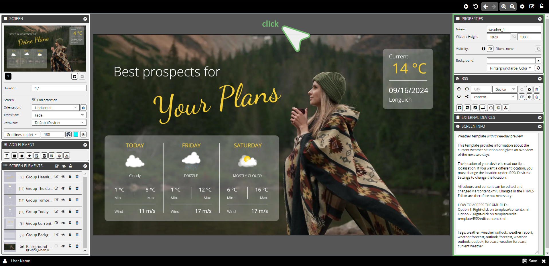
The basic settings of a screen are shown as long as no screen element is selected. If a screen element is selected, you can access the basic settings by clicking in the outer area of the screen.
The following tabs are available for setting a screen:
1. PROPERTIES
2. RSS
3. SCREEN INFO
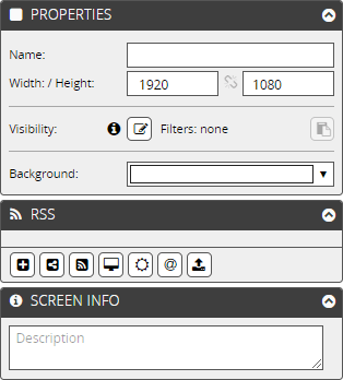
1. PROPERTIES
You can make the basic settings for the screen in the PROPERTIES tab.
These are described in the following sections.
Name
Shows the screen name.
Width/Height
Shows the format displayed in the screen design area, WxH in px.
The entries in the input fields can be changed by clicking on them.
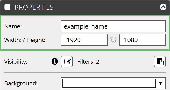
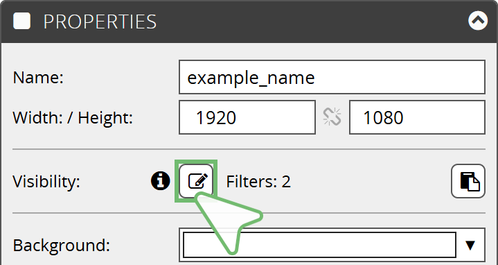
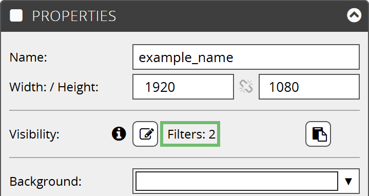
Visibility
You can use visibility filters to control the visibility of a screen in the playlist.
Edit
The Edit button opens an overlay window. In this window, you can define conditions for your screen in the form of an if-then function.
Overlay window – example:
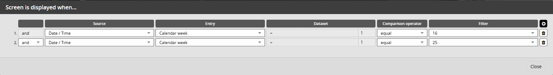
The fig. shows: The created if-then function informs the playlist to play the template in calendar week 16 and 25.
Visibility | Overlay window "The screen is displayed when..."
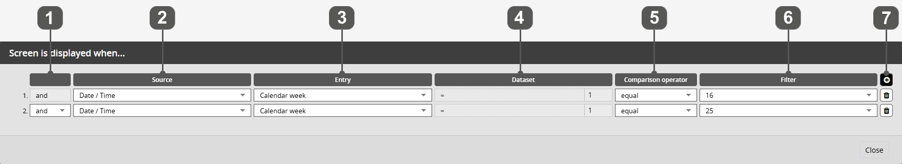
| 1. | and/or |
| | Here you specify whether a condition and/or takes place. In this case, and/or always refers to the previous condition. and → both conditions must be fulfilled or → only one condition must be fulfilled |
| | |
| 2. | Source (basis for X and Y) |
| | This is where you specify the data source. You can choose from date/time (calendar), device and a data source linked in the RSS tab (XML files, URL file, weather, meta social media channel). |
| | |
| 3. | Entry (X) |
| | Here you select a specific entry from your data source. The selection options depend on your data source. |
| | |
| 4. | Dataset (X) |
| | If your data source is based on XML data, you can now select a specific data set. The selection options depend on your data source. |
| | |
| 5. | Comparison operator (e.g. =) |
| | Here you set the selected entry/data set (X) in relation to a comparison source (Y). The following options are available: equal, not equal, starts with, ends with, contains, does not contain. |
| | |
| 6. | Filter (Y) |
| | The filter represents the comparison source (Y). The comparison source can refer to data from the data source or be filled individually (not possible in all cases). |
| | |
| 7. | Use the + symbol to add another condition. You can remove a condition using the trash can symbol. |
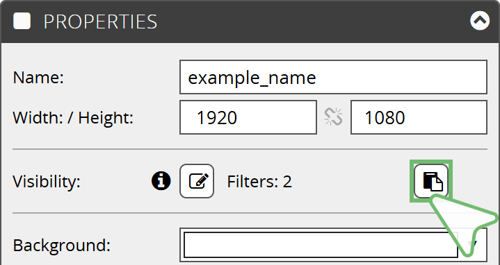
Visibility Filter
You can use this button to copy filters you have created and paste them elsewhere.
Filter
Shows the number of filters stored.
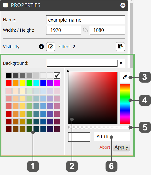
Background
Here you can define the background color of the screen. The selection applies to all screen formats (vertical, horizontal, square).
The following input options are available in the drop-down menu under Background:
| 1. | | Color palette |
| 2. | | Color field |
| 3. | | Pipette - You can use it to select colours from screen elements. |
| 4. | | Rainbow palette |
| 5. | | Transparency slider |
| 6. | | Color code input field (HEX/RGB) |
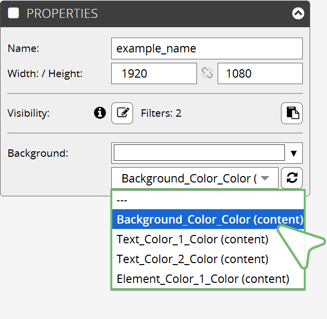
If an XML file with colors has been added to your screen (RSS tab), you can select a color from the XML file as the background at this point.
Link background color with XML file:
- Tab Properties
- Background | Lower input field
- Select the desired color via the drop-down menu
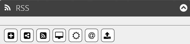
In the RSS tab, you can store data sources that are read by the program. The data is either automatically linked to screen elements, can be linked manually or uploaded.
The following data sources are available:
 | | Create external content |
 | | Shared Data |
 | | RSS |
 | | Local Data |
 | | Weather |
 | | Facebook or Instagram |
 | | Upload |
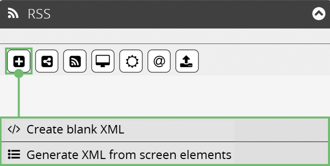
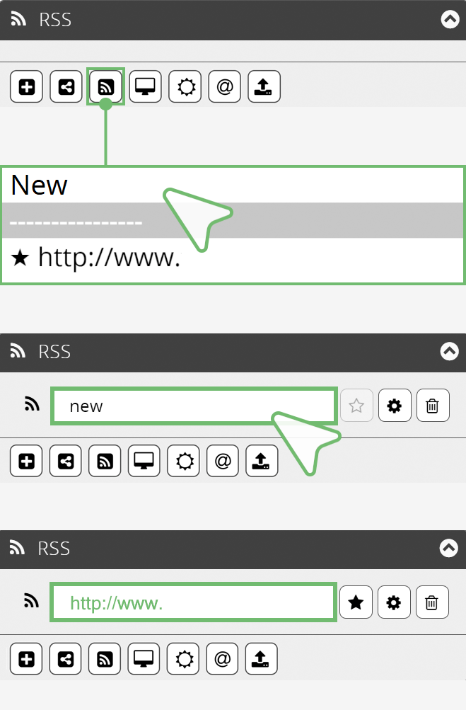
Create External Content
Under Create external content, you can generate your own XML files as a data source. You can use the + button to create either an blank XML file or an XML file from your screen elements.
Create Blank XML
Creates a blank XML file. You can fill this with content and link it to screen elements. You can find out how to link screen elements to an XML file in the chapter → Element Settings in the sections Content → Source.
Generate XML From Screen Elements
Creates an XML file from an existing screen design. The desired contents of a screen are read out and stored in an XML file. All screen elements are automatically linked to the XML file.
Detailed information on creating XML files can be found in the chapter → Create XML.
The created XML file is shown in the RSS tab with its name.
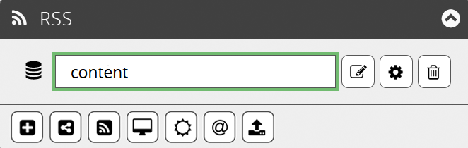
 | | Edit |
| | | |
 | | Settings Opens an overlay window providing further settings options. Here you can show a preview of the filtered data on the General tab. Click on the → Test filter settings button to open the preview. Further information you will find in the RSS |Settings section. |
| | | |
 | | Delete Removes the XML file from the list. |
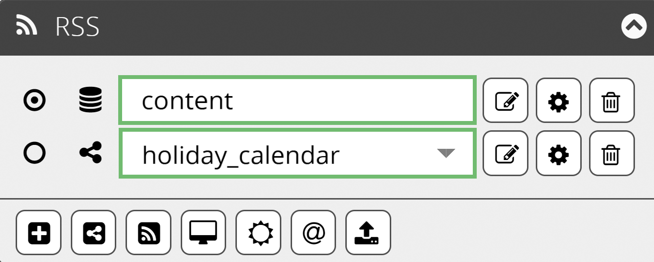
Shared Data
The Shared Data button allows you to integrate the same XML file into different screens and manage content centrally. If shared data has already been created, you can select it from a list of shared XML files under Shared Data.
Additionally, you can also generate your own shared XMLs here by creating a blank XML file or an XML file from the screen design.
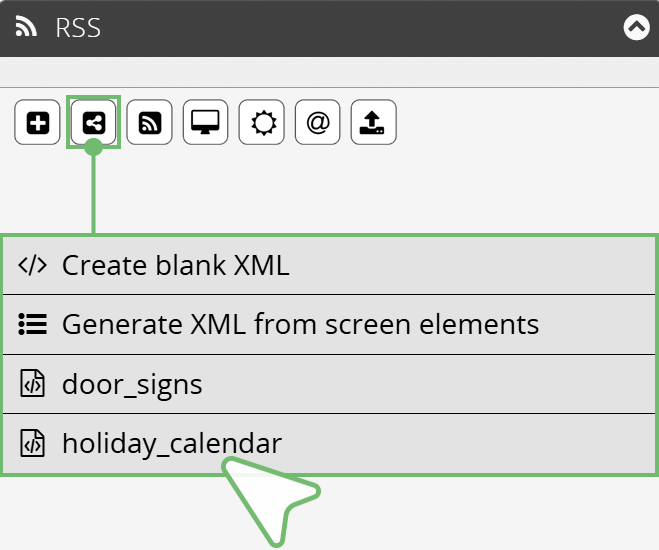
The fig. shows the two XML files door signs / holiday calendar.
Create Blank Shared XML
Creates a blank XML file. This file you can fill with content and link to screen elements.
You can find out how to link screen elements to an XML file in the chapter → Element Settings in the sections Content → Source.
Generate Shared XML From Screen Elements
Creates an XML file from an existing screen design. The desired contents of a screen are read out and stored in an XML file. All screen elements are automatically linked to the XML file.
Detailed information on creating XML files you will find in the chapter → Edit and Manage XML.
The created or selected XML file is shown in the RSS tab with its name.
The fig. shows: Top - created XML file / Bottom - XML file from the list.
Further functions offer the buttons:
| | Edit
|
| | | |
| | | Settings Opens an overlay window providing further settings options. Here you can show a preview of the filtered data on the General tab. Click on the → Test filter settings button to open the preview. Further information you will find in the RSS |Settings section. |
| | | |
 | | Delete Removes the XML file from the list. |
RSS Feed
Using the RSS Feed button allows you to link a URL as a data source.
You have the option of linking a new URL or selecting one from the favourites list.
How to add a new URL:
- RSS tab
- RSS-Feed button
- Select New from the drop-down menu
- Add the URL to the input field
You can find out how to link screen elements to an RSS Feed in the chapter → Element Settings in the sections Content → Source.
Further functions offer the buttons:
 | | Favorites Clicking on the Favorites symbol adds the selected URL to the favorites list in the drop-down menu. |
| | | |
| | Settings Opens an overlay window providing further settings options. Here you can show a preview of the filtered data on the General tab. Click on the → Test filter settings button to open the preview. Further information you will find in the RSS |Settings section. |
| | | |
 | | Delete Removes the RSS Feed from the list. |
Local Data
In addition to the usual method of uploading content to our cloud and distributing it to the players from there, our software also offers the option of integrating and playing local files in .xml, .csv, .ics and .jason format directly on a player.
This is mainly used for large files (e.g. long videos) or sensitive content.
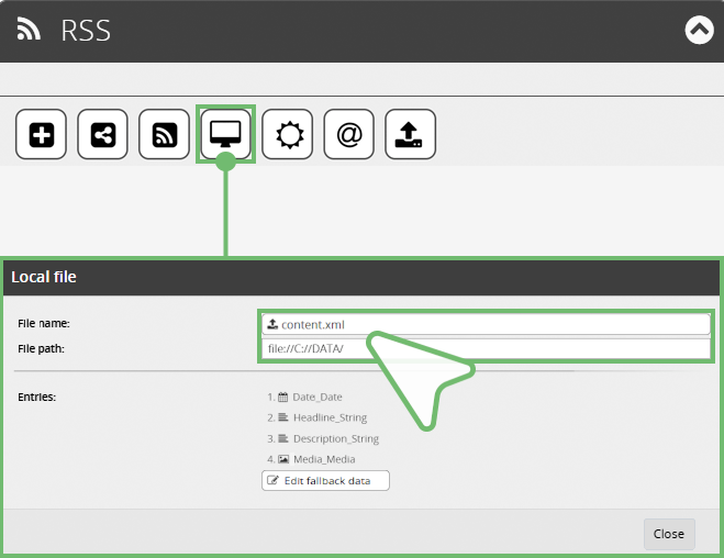
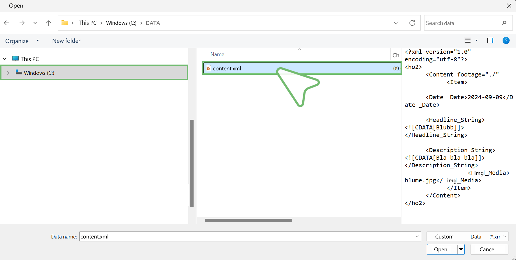
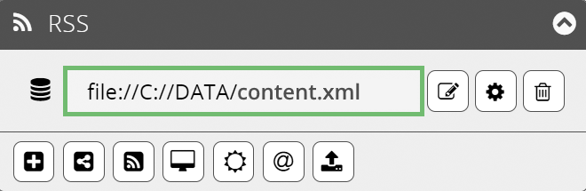
Define the file storage location in the software:
To do this, first enter the file name and then the path where the file is located.
Example:
File name → content.xml
File path → file://C://DATA/
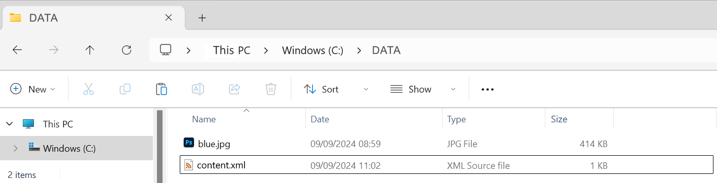
Updating the Files:
To update the content, you must place the new file with the same name in the same folder on the player. The player recognises the new file and plays it accordingly.
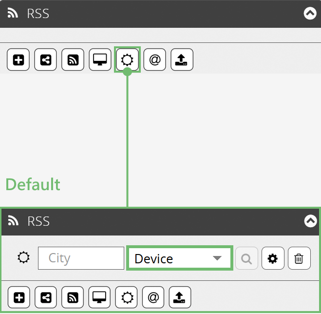
Weather
Clicking the Weather button allows you to link a weather URL as data source. In doing so, you have the option of selecting the device location or your own weather location as the source of reference.
How to add a weather feed:
- RSS tab
- Weather button
- By default, the device location is preselected as the local source of reference.
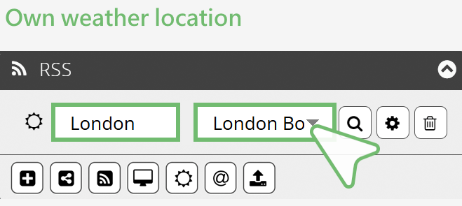
You are welcome to enter your own weather location:
- Enter the desired location in the City input field (e.g. London)
- Specify the location using the drop-down menu in the right-hand field (e.g. London Borough of Harrow )
Further functions offer the buttons:
 | | Search Use the Search button to update the selection options in the pop-up menu. |
| | | |
| | Settings Opens an overlay window providing further settings options. Here you can show a preview of the filtered data on the General tab. Click on the → Test filter settings button to open the preview. Further information you will find in the RSS |Settings section.
|
| | | |
 | | Delete Removes the RSS feed from the list. |
Instagram or Facebook
The @ allows you to link a Meta Social Media account – Instagram oder Facebook – as a data source.
In contrast to the ready-made social media designs that are added via → Add element, you can create your own designs by integrating the accounts via RSS.
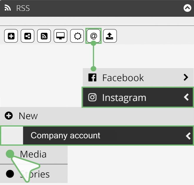
How to link a Meta Account:
- RSS tab
- Instagram or Facebook button
- Choose between Instagram or Facebook in the drop-down menu
- Select + New
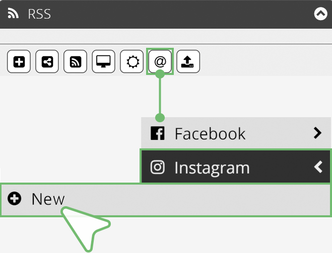
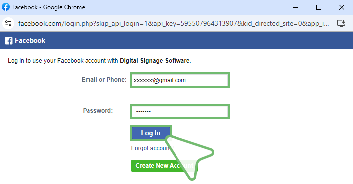
- A login window opens.
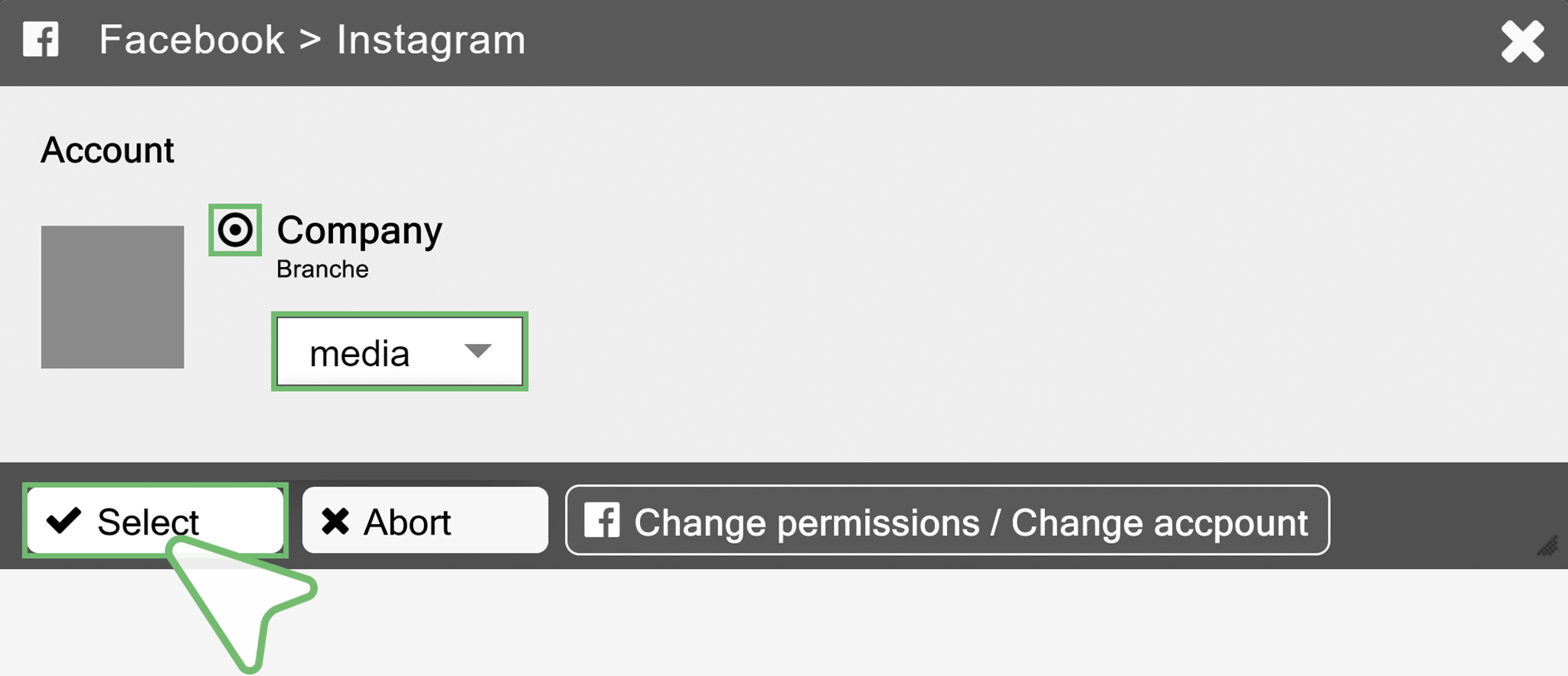
- Finally, select the account.
- For Instagram, also the data source Media or Stories.
- Confirm with Select.
- Now you see the inked Facebook/Instagram account in the RSS tab.
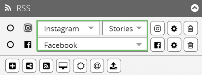
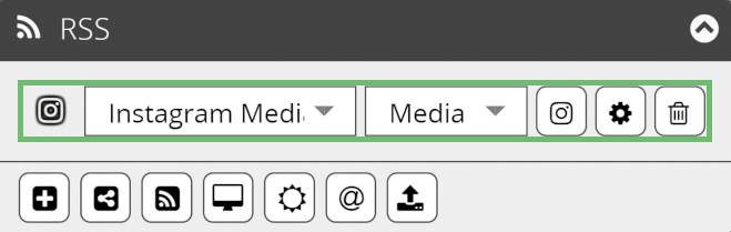
If you have linked several Facebook or Instagram accounts, you can switch between the accounts using the respective drop-down menu.
For Instagram the selected data source Media or Stories is also displayed. You can use the drop-down menu to switch between Media or Stories.Further functions offer the buttons:
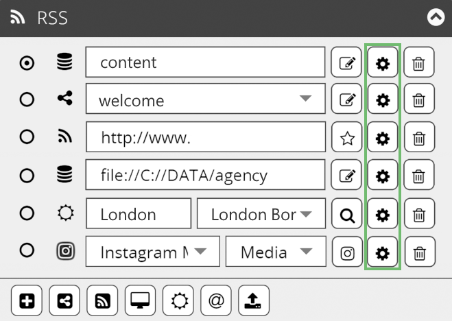
  | | Edit These two buttons take you to the account information. Depending on your account, either the Instagram or Facebook icon will be displayed. |
| | | |
| | Settings Opens an overlay window providing further settings options. Here you can show a preview of the filtered data on the General tab. Click on the → Test filter settings button to open the preview. Further information you will find in the RSS |Settings section. |
| | | |
 | | Delete Removes Instagram or Facebook from the list. |
How to add an already linked account to the RSS tab:
- RSS tab
- Instagram or Facebook button
- Choose between Instagram or Facebook in the drop-down menu
- Select account
- For Instagram, select the data source Media or Stories
- Now you see the inked Facebook/Instagram account in the RSS tab.
If you have linked several Facebook or Instagram accounts, you can switch between the accounts using the respective drop-down menu.
For Instagram the selected data source Media or Stories is also displayed. You can use the drop-down menu to switch between Media or Stories.
RSS |Settings
You can use the Settings button to add further attributes to a data source.
An overlay window opens with the scope of which depends on the content of the data source.
In the following sections, we explain the setting options for the overlay window.
- XML Files
- Shared Data
- URL
- Local Data
- Weather
- Instagram and Facebook
- FILTERS
- SORT
- INFO
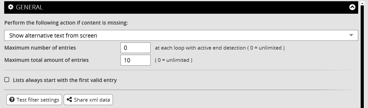
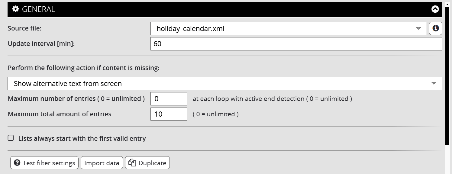
Gerneral Settings | XML Files
- Missing entries can be assigned a specific behaviour:
- The number of entries displayed per run and in total can be limited.
- A playback sequence can be assigned to the entries.
- The Test filter settings button opens a further overlay window. This shows the filtered data preview.
- If you want to convert the XML file into a shared XML after it has been created, you can do this by clicking on the Share xml data button.
| - Show alternative text from screen - Skip screen - Play alternative |
Gerneral Settings | Shared Data
If your data source is a shared XML file, you have the following setting options:
- The XML data source can be changed.
- A refresh interval can be defined to keep the displayed data up to date.
- Missing entries can be assigned a specific behaviour:
- The number of entries displayed per run and in total can be limited.
- A playback sequence can be assigned to the entries.
- The Test filter settings button opens a further overlay window. This shows the filtered data preview.
- Using the Import file button, you can import shared data. This is automatically converted into an XML file. There is no need to update the data.
- Using the Duplicate button, shared data can be duplicated.
| - Show alternative text from screen - Skip screen - Play alternative |
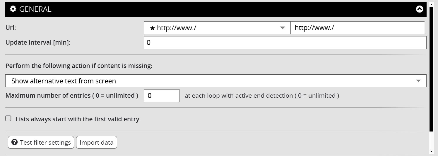
Gerneral Settings | URL
- The URL can be changed.
- A refresh interval can be defined to keep the displayed data up to date.
- Missing entries can be assigned a specific behaviour:
- The number of entries displayed per run and in total can be limited.
- A playback sequence can be assigned to the entries.
- The Test filter settings button opens a further overlay window. This shows the filtered data preview.
- Using the Import file button, you can import URL data. This is automatically converted into an XML file. There is no need to update the data.
| - Show alternative text from screen - Skip screen - Play alternative |
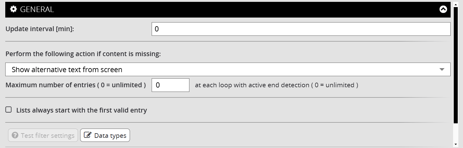
General Settings | Local Data
- A refresh interval can be defined to keep the displayed data up to date.
- Missing entries can be assigned a specific behaviour:
- The number of entries displayed per run and in total can be limited.
- A playback sequence can be assigned to the entries.
- The Data type button opens an overlay window showing a detailed list of all linked data.
| - Show alternative text from screen - Skip screen - Play alternative |
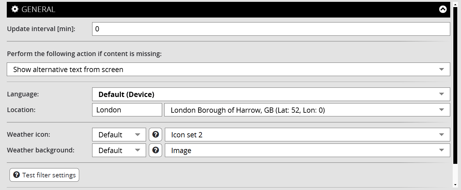
General Settings | Weather
- A refresh interval can be defined to keep the displayed data up to date.
- Missing entries can be assigned a specific behaviour:
- The language and location of the data source can be customised and specified.
- Weather icons and weather backgrounds can be set.
- The Test filter settings button opens a further overlay window. This shows the filtered data preview.
| - Show alternative text from screen - Skip screen - Play alternative |
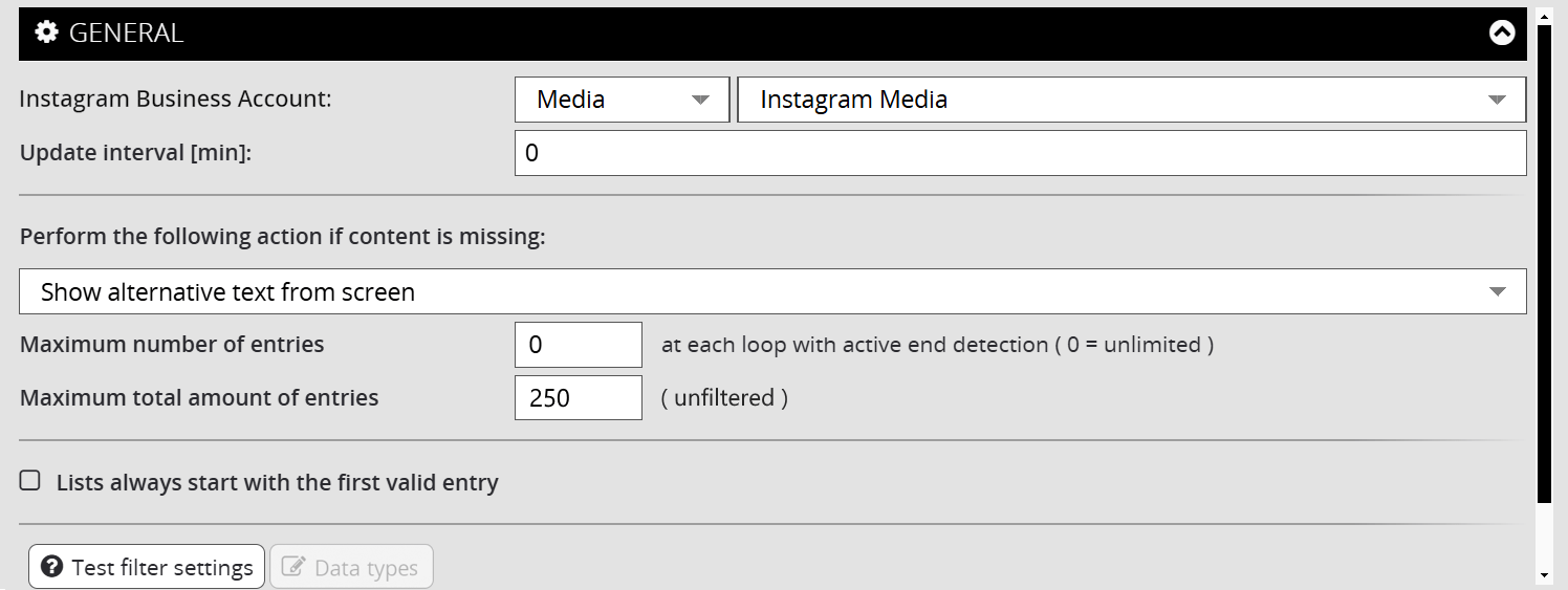
General Settings | Instagram and Facebook
- The account or the account area (Media/Stories) can be changed.
- A refresh interval can be defined to keep the displayed data up to date.
- Missing entries can be assigned a specific behaviour:
- The number of entries displayed per run and in total can be limited.
- A playback sequence can be assigned to the entries.
- The Test filter settings button opens a further overlay window. This shows the filtered data preview.
- Using the Import file button, you can import URL data. This is automatically converted into an XML file. There is no need to update the data.
| - Show alternative text from screen - Skip screen - Play alternative |
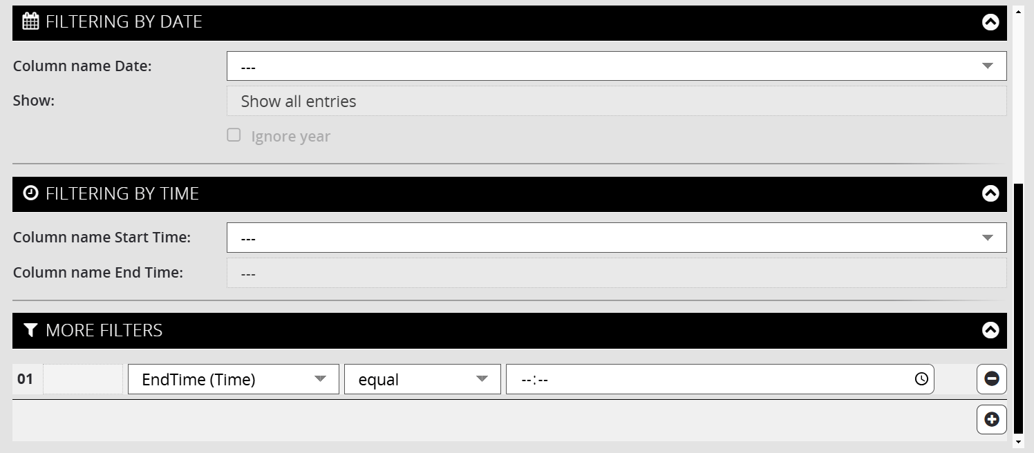
Settings | Filter
Date and time filters offer the option of filtering the entries of a data source according to specific time criteria. The scope of the available filters depends on the content of the data source.
In the Further filters tab, you can store individual filter conditions in the form of an if-then function. The + button adds a condition, the trash bin button deletes.
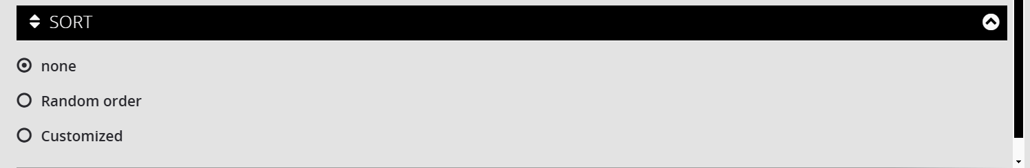
Settings | Sort
The sorting determines the order in which the data is played. The default option is ‘none’.
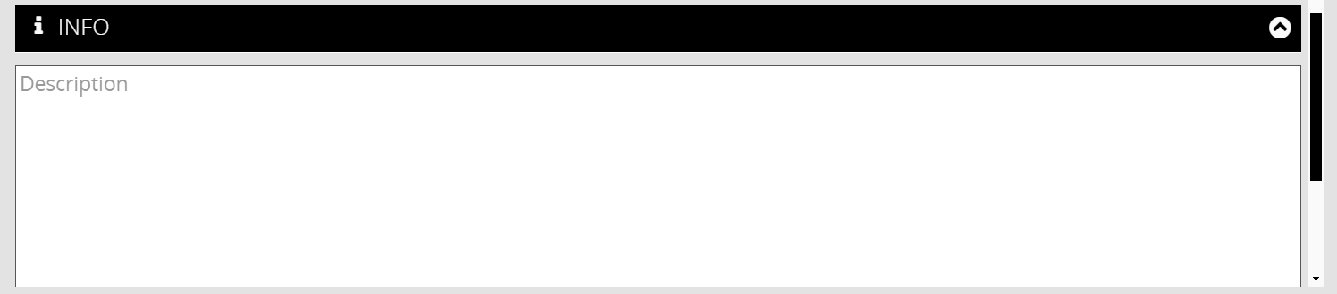
Settings | Info
The Info tab offers you an input option for information.
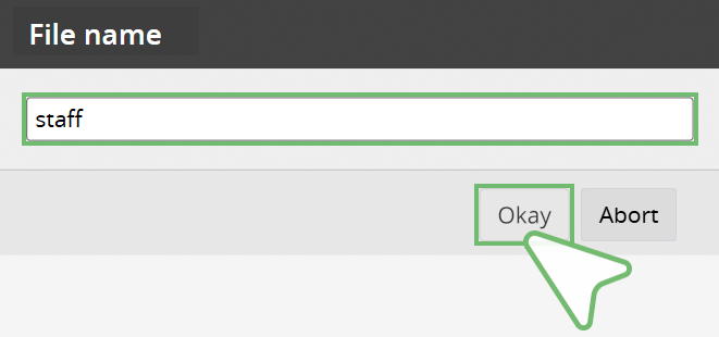
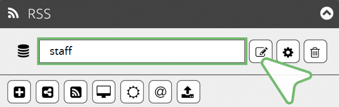
Upload
The Upload button allows you to upload the .xml, .csv and .json file formats.
- RSS tab
- Upload button
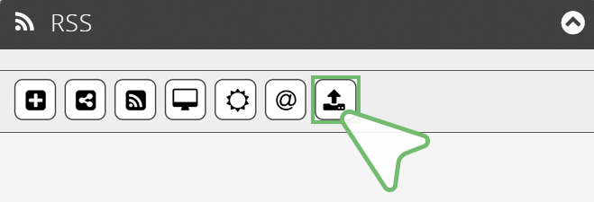
- Select and open file (.xml, .csv, .json)
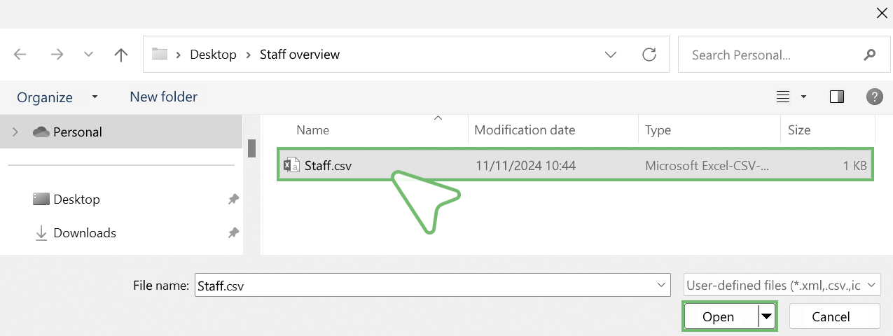
- Enter desired file name and confirm with Okay.
The files are automatically converted into an XML file and can be customised using the Edit button.
You can find detailed information on creating and editing XML files in the chapters → Create XML and → Edit and Manage XML.
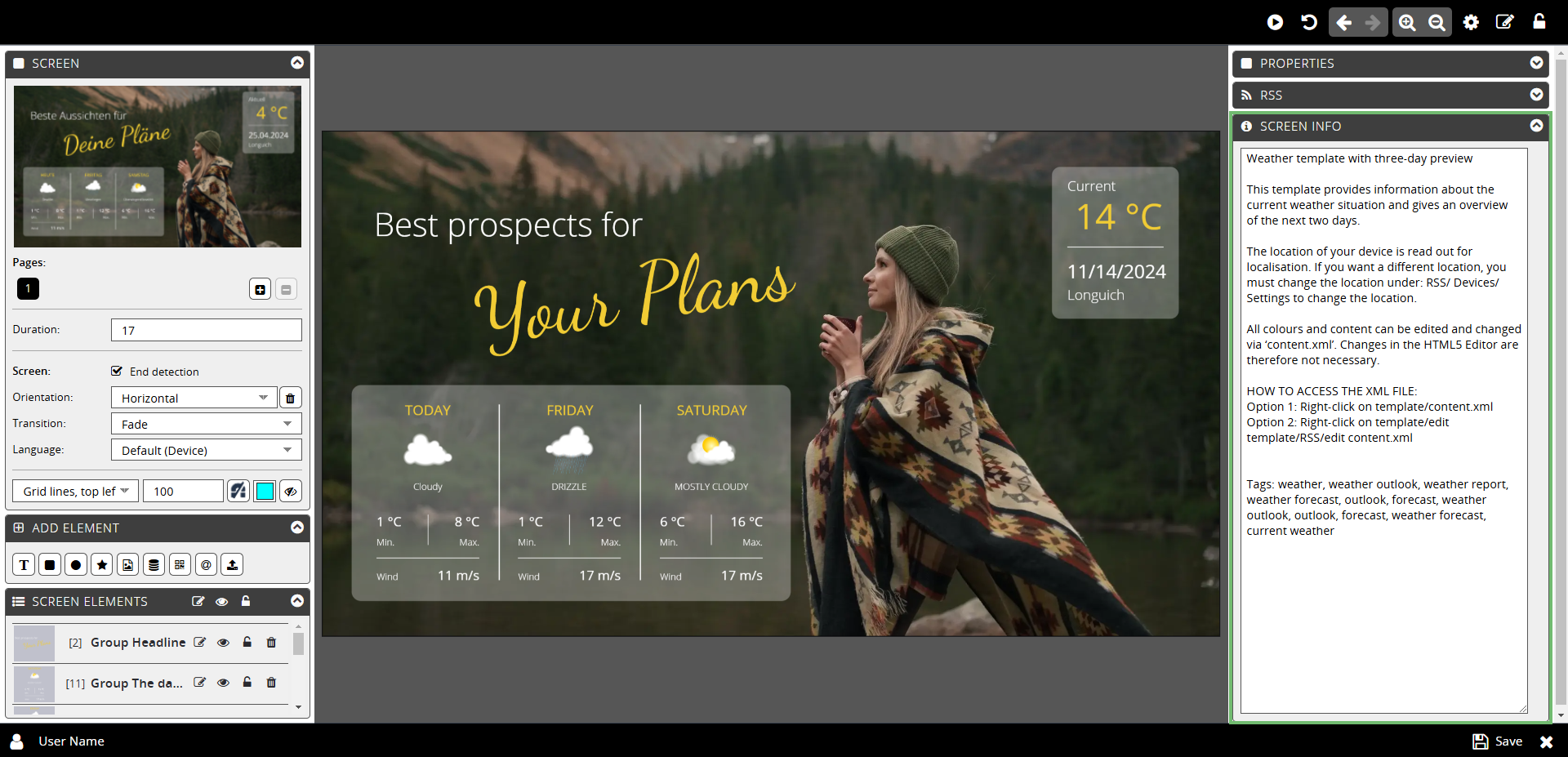
The SCREEN INFO tab provides space for a description.
The description entered here is displayed in the Tooltip together with the screen image, the screen name, the license notes, the formats and the file size.
You can find further information on the Tooltip in the chapter → Screens | section Tooltip.